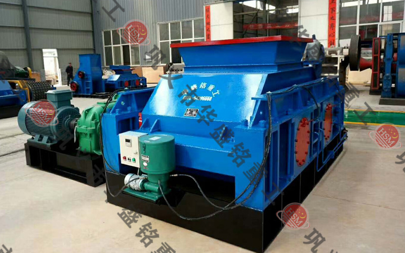


华盛铭机械还可为用户免费提供对辊式破碎机械设计以及品牌、型号、结构等技术咨询。
时产50吨石英石 多少钱?随着建筑行业的不断发展,对于高品质砂石的需求也越来越大。为了满足市场需求。对辊破...
大型辊压机厂家在哪?2024-04-12在砂石骨料产业中,大型辊压机以其强大的生产能力、稳定的运行性能以及出色的破碎效果...
砂厂用液压对辊制砂机出料效果怎么样?2024-04-05砂厂,作为现代建材工业的重要组成部分,是专门从事砂石骨料生产的企业实体。它们依托...
辉绿岩,作为一种重要的基性火成岩,源自地球深处的岩浆活动,其主要由基性斜长石和辉石矿物紧密结合而成,具有硬度高、耐磨性强、耐腐蚀等特点,是建筑、公路、铁路及其他基础设施建设中不可或缺的高质量骨料和集料
2024-03-04钢渣辊压机有着不同的型号大小,质量不同,生产厂家的实力不同,选用的技术和原料也会不一样,这些都会影响到设备的生产成本,而销售方式、市场竞争等也会影响到厂家的报价,所以用户不能盲目追求低价设备,忽略了质
2023-12-02重晶石 可是中硬物料破碎领域的扛把子,其受欢迎程度可见一斑,一方面是设备耐磨损,智能化程度高,另一方面是成品粒型和产量可观,重晶石 时产可达2-240吨,可将5公分以下石块加工到5毫米
2023-12-01大型辊压机厂家在哪?在砂石骨料产业中,大型辊压机以其强大的生产能力、稳定的运行性能以及出色的破碎效果,成为众多大型砂石生产线的核心设备。为建筑、公路、铁路、水利等基础工程建设提供源...
砂厂用液压对辊制砂机出料效果怎么样?砂厂,作为现代建材工业的重要组成部分,是专门从事砂石骨料生产的企业实体。它们依托丰富的天然矿产资源或回收利用各类建筑废弃物,通过一系列破碎、筛分、洗选等工艺流程...
矿渣用液压式辊压机效果怎么样?多少钱?矿渣,是工业生产过程中产生的副产品,主要源于钢铁冶炼、水泥制造等行业的高温熔融物在冷却过程中形成的固体废弃物。矿渣中含有多种可再利用的矿物质成分,通过合理的加工...
全球生产现场汇聚,技术人员对物料深度解析,量身为您设计科学、合理的破碎方案。
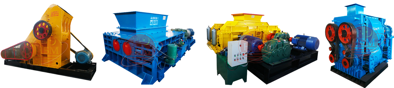
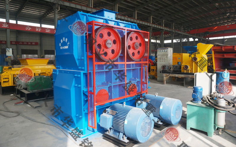
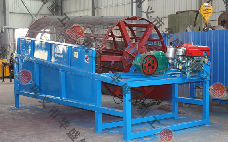
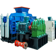
原料:花岗岩 瓜米石 鹅卵石 河卵石 石英石 大理石 钢渣 铁矿石等
时产:150-200t/h
成品:5mm
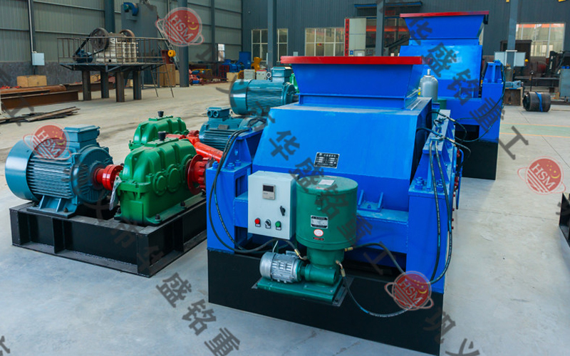
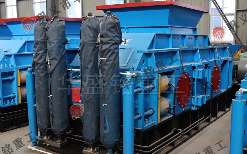
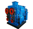
设备配置:
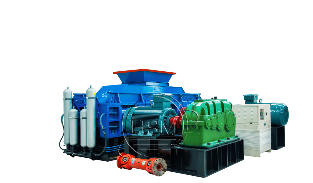
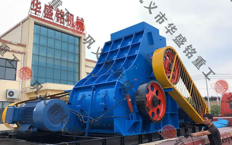
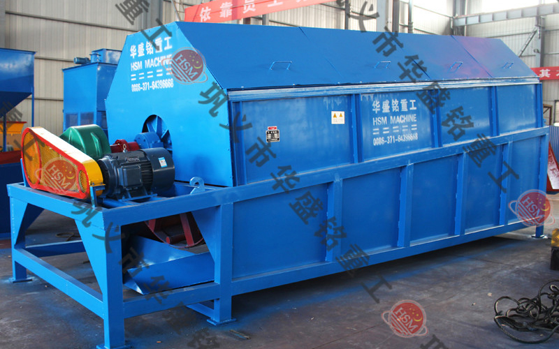
原料:花岗岩 瓜米石 鹅卵石 河卵石 石英石 大理石 钢渣 铁矿石等
时产:150-200t/h
成品:5mm
设备配置:
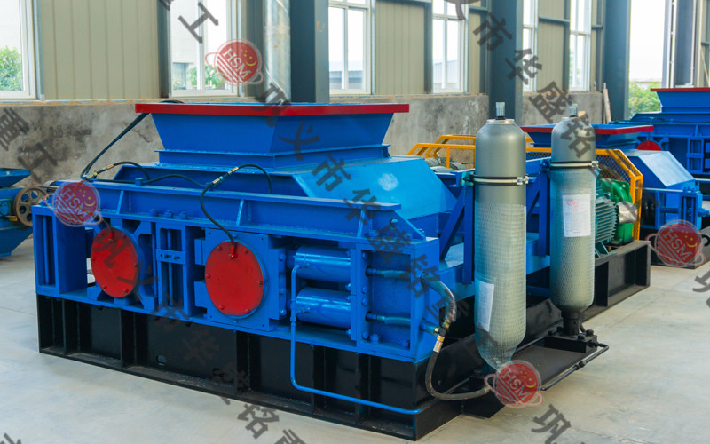
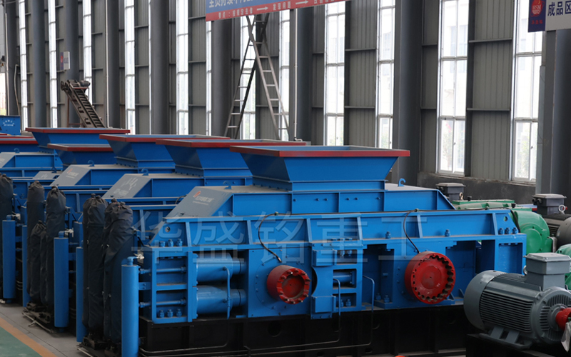
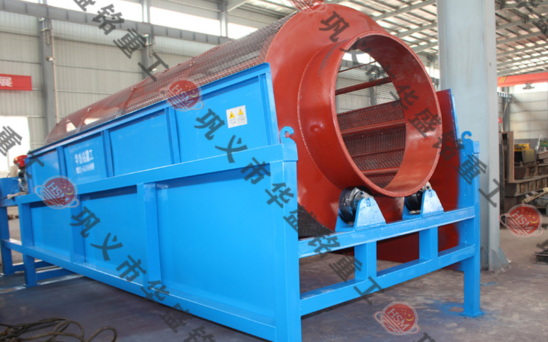
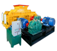
原料:花岗岩 瓜米石 鹅卵石 河卵石 石英石 大理石 钢渣 铁矿石等
时产:120-150t/h
成品:5mm
设备配置:
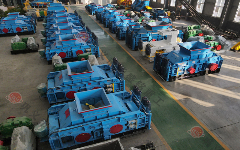
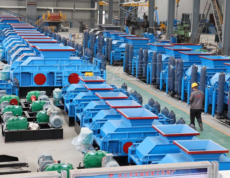
质量是公司的生命,是品牌的灵魂。华盛铭坚信唯有的智能化技术检测才能出更好、更优的机器。
我们公司生产的每台对辊式破碎机都要求精益求精,认真做好每一台对辊式破碎机。
 项
工程检测
项
工程检测
 道
环保检测工序
道
环保检测工序
 项
质量检测
项
质量检测
 个
核对数据
个
核对数据
“利居众后,责在人先”。华盛铭始终本着开拓创新、互利共赢的宗旨,将绿色制造、节能减排的理念放在主要位置,真诚对待每一位客户,认真做好每一台、每一个零件。华盛铭所拥有智能制造车间,质检电子化率达99%,物料准时配送率超95%,用金标准产品在国内外市场开花。
本公司私人定制生产对辊式破碎机/四辊破碎机·时刻为您解答